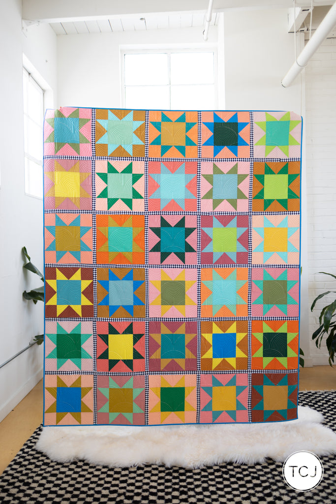
The Star Adventure Cover Quilt is here! I can't wait to dive into all the photos and the experience of sewing this quilt together. But first, you can read about four other samples we made for the Star Adventure pattern release.
The Star Adventure Cover Quilt took me the longest to decide which design style I wanted to use and what color palette I wanted to work with. I didn't confirm for sure that this sample would be our cover quilt until after we finished sewing the top together.
Once I decided I wanted to make a Large Throw that finishes at 69" x 83", I also knew I wanted to use either Fat Quarters or Quarter yards for both the stars and background. That means I would be using 30 different colors. If I used Fat Quarters for the background cuts, I could also make the sashing scrappy. If I used Quarter yards, I would need to pick a yardage for the sashing. Since I had already made 2 samples with scrappy sashing (Sunflower and Rejoice), I decided it would be best to show sashing as yardage and that had contrast to the blocks. So then it was decided I would use Quarter Yards and contrast sashing.
From here, besides picking the actual fabric colors, I needed to decide if I wanted to showcase Solid Stars, Mixed Stars or Scrappy Stars. I landed on Mixed Stars to show all the fun color play without it looking immediately scrappy. Here are the mock ups of each option - Solid Stars, Mixed Stars + Scrappy Stars with contrast sashing.
We ultimately chose the middle mock up in this exact color way above. But, I did play with a couple other color ideas, I will show you below! I obviously fell in love with the idea of using gingham as the sashing early on. It is so fun and frames each star beautifully.
The color palette I choose had me really stretch myself. I went for an earthy, desert focused palette. It has a variety of colors that are more muddled and less crisp than I typically work with. I, of course, couldn't not use a bright yellow and a bright blue. But some of the more burnt reds, oranges and dusty greens and golds are not my usual go to colors. I was nervous that maybe this palette wouldn't turn out how I hoped.
Once we bought all the fabric on bolts (I had to commit before even seeing the colors together in real life) and we cut our sample out, the colors looked gorgeous together. I ended up creating a soft desert rainbow without even trying! I felt a bit more confident in my color choices thankfully.
For anyone who is curious on the fabric colors we used, here is our list. The background fabrics are the left stack of fabrics and the star fabrics are the right stack of fabric. These are all Bella solids for Moda Fabrics.
From top to bottom of the left stack (background cuts): Caramel, Amber, Clementine, Melon, Coral, Betty's Pink, Peach Blossom, Peach, Bunny Hill Pink, Rose Water, Coral Rose, Tea Rose, Nectar, Blush, Rust
From top to bottom of the right stack (star cuts): Citrine, Mustard, Bronze, Harvest Gold, Lagoon, Scuba, Teal, Bermuda, Spearmint, Sprout, Betty's Green, Terrain Cactus, Leprechaun, Christmas Green, Bright Sky.
The sashing is Carolina Gingham in 1/4" Black from Robert Kaufman.
After all of our fabrics were cut, we made our block piles. During this process, I started doubting my color choices greatly. I kept telling Alysson these color combinations did not look like me. I would lay pieces out and say "ew, what am I doing?" "I do not like these colors together." "What have I done?!"
But over the years, I have learned to trust my gut. I typically have the vision in my head first, I make decisions, and then the middle is messy but the end product turns out how I hoped. And so I forged forward hoping that my vision in the end would come to life. And guess what - it did!
We sewed our blocks together quickly. Alysson and I tag teamed this process as we had deadlines to meet for our longarm quilting needs. Even as the blocks were being made and added to the design wall, I felt unsure. There were some color blocks I loved and some I really did not like. But as more and more stars got added to the wall, I started to see the whole color palette come back together.
I removed all of the blocks off the wall and lined them up for photos and the color gradient and sub palettes I created were brought to life. I was finally confident that the overall quilt would look exactly as I hoped. The missing puzzle piece was the gingham sashing, it would bring it all together perfectly.
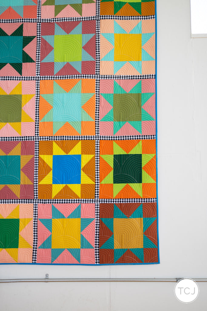
It's so fun to see the color story of the background and the stars. The background is all about clay colored tones - thinking Sedona AZ vibes. And then the stars are a gradient of plant life to sky - some yellows, dusty greens, teals to bright blue. We then put the blocks back on the wall, finalized the layout and started sewing our stars into rows with the gingham sashing.
YES! The first site of gingham in the quilt top. Soooooooooo good.
The second we finished this quilt top, Alysson and I both exclaimed that it was our favorite! It is so bold and fun and happy and the gingham sashing *chef's kiss*! So so good. Getting some full shots was a tad difficult since it's so large and Alysson is 5' 4". But it is fun to see the movement in the top!
We decided to try and shoot some final quilt tops back in our studio where Alysson could stand on a chair.
We also popped into an empty unit in our building. It has such a fun cool old exposed wall. I love the brick and painting.
The variety of the color in these blocks is really fun. The eye dances over the quilt and the gingham is the only consistent part of the top. The black and white adds a classic touch to a very colorful quilt.
I knew which pantograph I wanted quilted onto this sample before I sent it off. I wanted City of Fountains for its density and its rounded movement. I told Emily of So Sunny Quilts and she confirmed that she thought it would be amazing on this top!
I also tossed back and forth on what to bind this top in. The final three contenders were a solid black, the same gingham as the sashing or a bright blue. The gingham felt a bit too intense to frame the quilt completely. The black felt too harsh. But a bright blue felt right - there is only one bright blue in the whole top so it felt like a really fun nod to that. We used what we had on hand which is a Kona Sheen in Dazzling Blue. What is really fun about Kona Sheen is one side is just kona cotton and the other side is a printed on metallic shimmer. So I decided to alternate the strips in the sashing to be half solid side, half shimmer side. It is very subtle but a fun little pop when you see it in person.
Taking all of our own photos gives us a lot more freedom and control. But, I also have zero self control on deleting any photos that turn out well, even if 20 of them all look the same. ha! I gotta get better about that but we did capture a lot of beautiful photography of this sample.
This was the first quilt we photographed, so we tested a bunch of different set ups and anytime the fluffy white rug came into a shot, Redford curled up right on it.
Then Alysson got into the shots and of course Redford had to get back into them. He and Alysson have a special love story.
We really love this quilt a lot. The way the quilting finishes it perfectly is amazing. The City of Fountains pantograph sort of reminds me of the sun rising and setting in the desert in a modern way. We did a fun little styled shelf shot with the cover bundles and some flowers and art and the quilt.
We backed this sample in a Speckled Dove Wide Back from Ruby Star Society. I love the small pops of metallic, it is soothing for such a fun bold front.


 Taking all of our own photos gives us a lot more freedom and control. But, I also have zero self control on deleting any photos that turn out well, even if 20 of them all look the same. ha! I gotta get better about that but we did capture a lot of beautiful photography of this sample.


 Then Alysson got into the shots and of course Redford had to get back into them. He and Alysson have a special love story.


 We backed this sample in a Speckled Dove Wide Back from Ruby Star Society. I love the small pops of metallic, it is soothing for such a fun bold front.